What does “average font size” actually mean?
There is no single official “average font size” defined by WCAG or browser vendors. Instead, designers and frameworks have converged on typical defaults:
Web browsers: default root font size ≈ 16 px (1 rem)
Frameworks like Bootstrap use this as their base body text size.Accessibility experts: recommend 16 px (≈ 12 pt) for normal body text, and 24 px (≈ 18 pt) as a minimum for “large text” (used e.g. for low-contrast situations).
Mobile platforms:
iOS Human Interface Guidelines: 17 pt is the default body style.
Material Design: common body sizes are 14–16 sp for body and list items.
So when people ask “what is the average font size?”, what they usually want is:
What size should my body text and headings be so they’re readable and accessible in my context?
That’s what we’ll answer.
WCAG font size rules & accessibility (2025 update)
WCAG (currently 2.2, with 2.1 still widely referenced) does not prescribe a specific minimum font size. Instead, it focuses on scalability and contrast:
SC 1.4.4 – Resize Text: users must be able to resize text up to 200% without loss of content or functionality.
Best practice: use relative units (em, rem) so text scales with user/browser settings.
Accessibility and UX experts build on this by suggesting concrete targets:
For normal body text, a readable font size is usually 16 px / 12 pt or larger.
For large text (e.g., for low contrast or key calls to action), plan around 24 px / 18 pt or larger.
Think of WCAG as the rules, and these sizes as practical interpretations that meet or exceed those rules.
Standard font sizes by platform
1. Websites (desktop & tablet)
For web font size guidelines, a solid starting point today:
Body text:
16–18 px (1–1.125 rem) for normal paragraphs
18–20 px for long-form reading or older audiences
Headings (rough scale):
H1: 32–40 px
H2: 24–32 px
H3: 20–24 px
H4: 18–20 px
Frameworks like Bootstrap 5 explicitly set body text to 1 rem (~16 px) with line-height: 1.5 as an accessible base.
Minimum vs recommended (web):
Absolute minimum for body: 14 px (only in dense UIs, never for long paragraphs)
Recommended standard font size: 16–18 px
2. Mobile apps (iOS & Android)
Mobile typography must account for viewing distance and platform guidelines.
iOS (Apple HIG):
Default body text at the “large” setting: 17 pt (San Francisco).
Apple recommends body text not smaller than 11 pt in any setting, but in practice 17 pt is treated as the standard size for body.
Android / Material Design:
Material Design’s common body text: 14 sp, with 16 sp used for list items and text inputs in many modern patterns.
Recent UX guidance often suggests 16 sp as a minimum for body text to align with accessibility expectations.
Practical range for mobile body text:
14 sp/pt (hard minimum) in compact UI, labels, or helper text
16–17 sp/pt (recommended) for main reading content
20–24 sp/pt+ for primary titles and key headings
3. Desktop UI (apps, dashboards, software)
Desktop UIs sit between websites and dense tools (IDEs, trading platforms, etc.):
Body UI text (menus, labels, settings): 14–16 px
Data tables: 13–14 px can work if line-height is generous and contrast is high
Form labels & inputs: 14–16 px
Navigation items: 14–18 px depending on hierarchy and branding
For complex enterprise tools, don’t be afraid of slightly larger font sizes; users stare at these all day.
4. Print documents (letters, reports, CVs)
On paper, we switch to points (pt):
Body text:
Common standard font size for documents: 10–12 pt
CVs / résumés / proposals: stick to 11–12 pt for readability
Headings:
Subheadings: 13–16 pt
Main headings / titles: 18–24 pt
Good rule: If the printed text looks similar in comfort to a typical novel or office document, you’re likely in the 10–12 pt zone.
5. Books, magazines, posters & business cards
Books (paperbacks, novels):
Body text: 9–11 pt, depending on typeface, leading, and page size
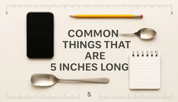
Line length: 60–70 characters per line (often about 4–5 inches wide — similar to many things that are 5 inches long in everyday life, like some small tablets or notepads)
Magazines & newspapers:
Magazines: 9–11 pt body, sometimes narrower columns with more leading
Newspapers: 8–10 pt, but with high contrast and short line lengths
Posters & signage (viewed from a distance):
A quick rule of thumb:
For 1–2 meters away, use at least 24–36 pt for main titles
For far viewing (across a room), go 72 pt+ for key words
Business cards:
Typical business card dimension is around 3.5 × 2 inches. On that tiny canvas, go for:
Name: 10–12 pt
Contact details: 8.5–10 pt (never smaller than ~7 pt)
Because of the small physical size, you must test printed output, not just on-screen mockups.
Comparison table: typical “average” sizes
| Context | Typical body text (standard font size) | Accessibility-friendly minimum | Common heading sizes | Units |
|---|---|---|---|---|
| Website (desktop) | 16–18 px | 16 px (14 px absolute min) | 24–40 px for H1–H2 | px / rem |
| Mobile app (iOS) | 17 pt | 15–17 pt | 20–34 pt | pt (UIKit) |
| Mobile app (Android) | 14–16 sp | 16 sp preferred | 20–32 sp | sp |
| Desktop UI / dashboards | 14–16 px | 14 px | 18–24 px | px |
| Office docs (print) | 11–12 pt | 11 pt | 14–24 pt | pt |
| Books | 9–11 pt | 10 pt | 14–18 pt | pt |
| Posters / signage | 18–24 pt+ | Larger is better | 36–72 pt+ | pt |
| Business cards | 9–11 pt | 8.5 pt | 10–14 pt (name) | pt |
Treat these as starting points, then adjust for font choice, language, and audience.
Minimum vs recommended font sizes
Minimum font size for accessibility (practical guidance):
Web & desktop:
Minimum: 14 px
Recommended: 16 px+ for body text
Mobile:
Minimum: 14 sp / pt (helper text)
Recommended: 16–17 sp / pt for body
Print:
Minimum: 9–10 pt depending on context
Recommended: 11–12 pt for documents and forms
Remember: contrast and line length matter just as much as the number itself. A 16-px grey text on a light grey background is much harder to read than 14-px black text on white.
Beyond size: line-height, spacing & weight
Line-height (leading)
For body text, good defaults:
Web / screen: 1.4–1.6 (140–160%) line-height
Print: font size + 2–4 pt (e.g., 11/14 pt)
Tighter text (line-height < 1.3) quickly becomes hard to scan, especially on small screens.
Line length
Aim for:
45–75 characters per line for body text
On phones, that usually happens naturally; on desktop, use max-width to avoid very wide lines.
If you think in physical terms: a line length similar to typical book columns, or roughly 4–5 inches on printed pages, is a good reference.
Letter spacing & weight
Body text weight: 400–500 (regular/medium)
For small sizes (≤ 14 px), medium (500) can improve clarity, but avoid extra-light or ultra-thin.
Keep letter-spacing near default; for all caps, add slight tracking (e.g. 0.05em).
Units: px vs pt vs em vs rem (and sp)
Understanding units is crucial to responsive typography and accessibility.
px (pixels)
CSS pixel, not necessarily a physical screen pixel anymore
Commonly used for exact sizes in UI components
Doesn’t automatically respect user’s browser text-size preferences
pt (points)
Traditional print unit: 1 pt = 1/72 inch
Used for print and in platform typography (iOS uses points)
On the web, pt is rarely used except for print stylesheets
em
Relative to the font size of the current element
1em= current font sizeUseful for spacing that should scale with text: e.g.
margin-top: 1.5em
rem
Relative to the root (html) font size
1remequals your base size, usually 16 px by defaultBest practice for web: define root size and scale with rem so users can zoom/rescale text easily; this is aligned with WCAG expectations for scalable text.
sp (Android)
Scale-independent pixels; like dp but obeys the user’s font size preference
Used for text on Android; ensures accessibility when users choose “Large text”
Rule of thumb:
Web: use rem for font-size, em for spacing, avoid hard-coded px when possible
Mobile: use pt (iOS) and sp (Android) so text scales with system accessibility settings
Print: use pt consistently
Responsive typography & clamp()
Modern CSS lets you create fluid, responsive typography that scales between a minimum and maximum using clamp():
html {

font-size: 16px; /* base */

}body {

font-size: clamp(1rem, 1rem + 0.5vw, 1.25rem);

line-height: 1.5;

}
This means:
Minimum: 1 rem (16 px)
Preferred range: scales with viewport width
Maximum: 1.25 rem (20 px), great for wide desktop screens
Responsive typography ensures a readable font size on small phones and large monitors without maintaining dozens of breakpoints.
This approach is now a core part of modern typography best practices for the web and pairs nicely with responsive layouts, from full-width pages down to compact business-card-style promo blocks.
Real-world examples of default font sizes
Here are some real systems and frameworks and their defaults:
Bootstrap 5 (web):
Root: 1 rem = 16 px
Body text:
font-size: 1rem; line-height: 1.5;
Material Design / Android (mobile):
Body text: commonly 14 sp, 16 sp for lists and important forms.
iOS Human Interface Guidelines:
Body text style at default size: 17 pt; text should generally not be smaller than 11 pt.
Accessibility experts (web):
Recommend 16 px (12 pt) as a standard font size for body text, 24 px (18 pt) for large text in low-contrast scenarios.
These are great benchmarks when you choose your own body text vs heading size scale.
People Also Ask (extended Q&A)
1. What is the best font size for websites?
For most websites, 16–18 px is the best starting point for body text, with headings scaling up to 24–40 px depending on hierarchy and brand.
2. What is the minimum font size for accessibility?
Practically:
Web: aim for 16 px as body text; don’t go below 14 px.
Mobile: aim for 16–17 sp / pt for body.
Print: keep important text at 11–12 pt or larger.
3. Which font size is easiest to read on screens?
For most users, 16–18 px on desktop and 16–17 sp / pt on mobile provide the easiest reading experience, assuming good contrast and line-height around 1.4–1.6.
4. Is 12 px too small for body text?
Yes for most content. 12 px may be acceptable for nonessential labels or dense interfaces but is too small for comfortable reading in paragraphs, especially for older users.
5. How big should headings be compared to body text?
A simple ratio:
H1: 2.0–2.5 × body size
H2: 1.5–2.0 × body size
H3: 1.25–1.5 × body size
For a 16-px body, that means ~32–40 px for H1.
6. Does font choice affect the “right” size?
Absolutely. Humanist sans-serifs (e.g. SF, Roboto) often read well at slightly smaller sizes than ultra-thin or decorative typefaces. If your font has narrow counters or very thin strokes, you may need to go up 1–2 px/pt.
7. What about line-height for mobile?
On mobile, 1.4–1.6 line-height is still ideal; anything tighter tends to feel cramped due to the narrower screen.
Quick FAQ
Q: Is 14 px OK for body text?
A: Only for compact UIs; for general reading, 16 px is safer.
Q: What’s the standard font size for documents?
A: 11–12 pt in print is the standard for reports, CVs, and business letters.
Q: Do WCAG specify a font size?
A: No specific size, but they require text to be resizable to 200% without breaking layout (SC 1.4.4).
Q: Should I use px or rem for web typography?
A: Use rem for font-size so user/browser settings scale your type, and em for spacing.
Q: How do I choose sizes for a design system?
A: Start with a base body size (16 px / 17 pt / 16 sp), define a simple scale for headings, and test on real devices and printed samples.
Final recommendation summary
If you just want a compact set of typography best practices you can apply today:
Pick a base body size per platform:
Web: 16–18 px
iOS: 17 pt
Android: 16 sp for primary body
Print: 11–12 pt
Ensure accessibility:
Use relative units (rem, em, sp, pt) so text respects user preferences.
Design layouts that remain usable when text is zoomed to 200%.
Design a clear hierarchy:
Body text vs heading size: 1 : 1.5 : 2 (body : H2 : H1) is a robust starting ratio.
Don’t rely solely on size—use weight, spacing and color carefully.
Optimize readability:
Line-height: 1.4–1.6
Line length: 45–75 characters (roughly column widths similar to book pages or other things in the 4–5-inch range).
Adequate contrast and normal or medium weight fonts.
Think responsively:
Use
clamp()and responsive typography so text naturally scales between mobile and large desktop screens.Test across a range of device sizes and, for printed materials, print at actual size (including small items like business card dimension layouts).
If you treat 16 px / 12 pt / 16 sp as your “average font size” baseline and adjust intelligently around it for context, your typography will feel modern, readable, and WCAG-aligned—without needing to memorize every platform nuance.